Elle North Bishop-Saunders A2 Media
Candidate Number: 5271
Centre Number: 22357

(37)
(32)
DIGIPAKS

A digipak is a type of packaging for CDs or DVDs, typically Digipaks consist of a gatefold paperboard with one or more plastic trays capable of holding a CD or DVD attached. Digipaks where first created by MeadWestvaco who are a leading global packaging company. Their product called Digi-Pak is trademarked. However the format became more popular and is now used by many manufacturers. Digipaks are a promotional aspect of the music industry which draw attention to audiences and encourage them to consume the product. In this day and age many people now purchase digital copies of songs rather than CDs. For example with the advance of apple and its itunes store. When you purchase songs from itunes the album artwork is also included. This usually shows up as a song plays on your apple product. This is a digital version of a Digipaks front panel. The album artwork is conventionally the same as the front cover on a physical copy DigiPak. Even if you use a CD to put onto an apple product on itunes you can add the album artwork using itunes album artwork.


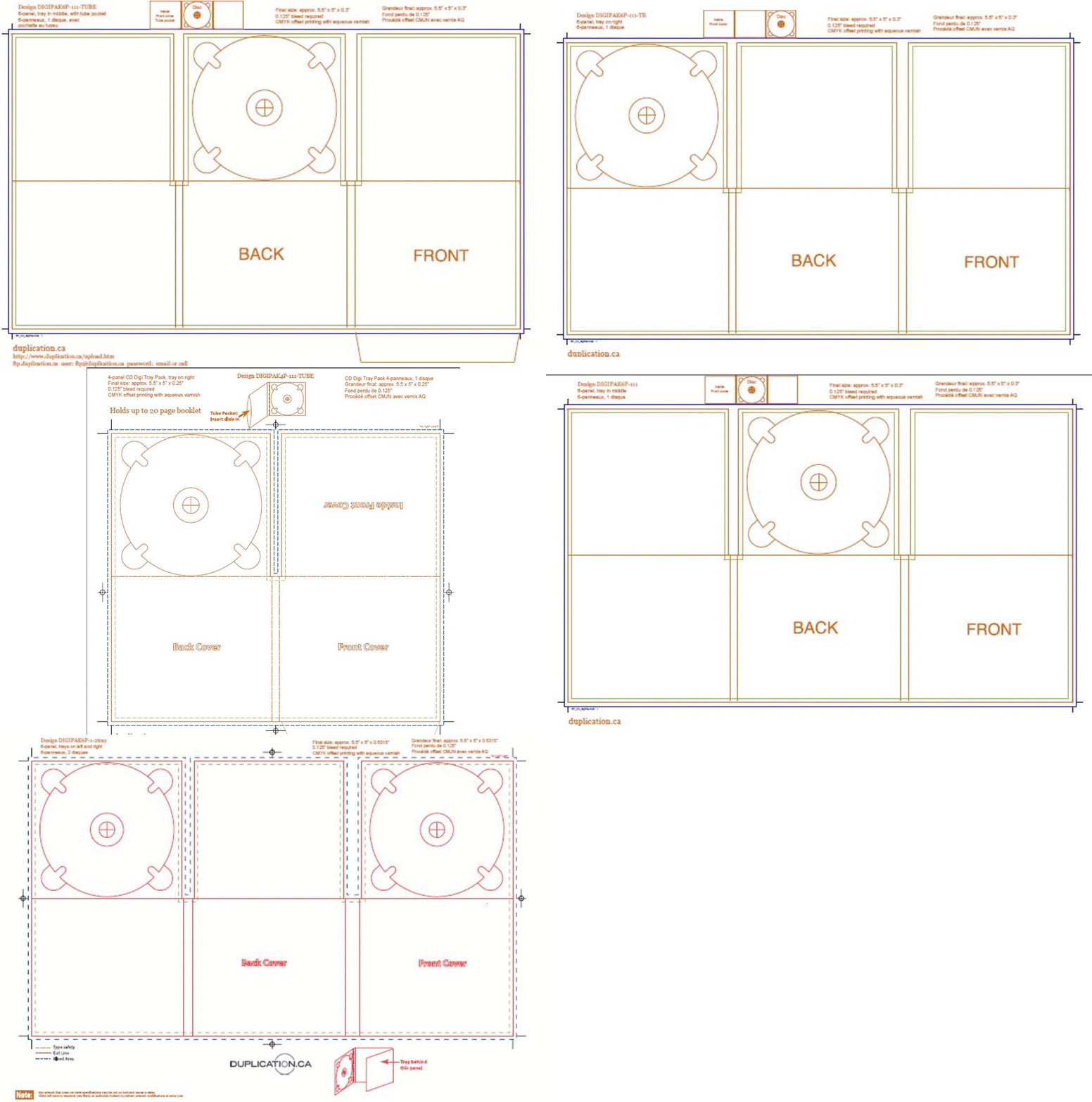
Below are some templates for various digipak designs sourced on (http://www.duplication.ca/printspecs/digipack.htm).

Main things usually in a Digipak
Front Panel
This is commonly the main photo of the artist; referencing to Andrew Goodwins theory where he recognises the use of 'star image'. Although it may just include artwork which links to the artist or the single/album.For example below are the two differnt types of album front covers. Magics Rude has album artwork which follows the theme of the song and the feel to it. The song itself has a very reggae feel good beat to it. The colours and sillouettes on the artwork support this as it is like they are sailing away to a carribean island. In contrast Jessie J's 'Alive' is very symplistic with the close up image of her. The only information on the front cover is the name of the band or artist and the title of the album/single. The name of the artist or band is usually larger than the title as this is the CDs main selling point. Fonts conventionally follow the theme or the album/single. Jessie J's artwork below has gone against this covention and has the title much bigger than her name. Although this is overlayed on top of the image. Her name still stands out more against the plain white background


Inside Panels
Inside Digipaks is again usually photos or the artist or artwork. Some include a little bit of information about the artist or personal messages. Most Digipaks have a small booklet come out which include more photos and lyrics.

Back Panel
The back pannel usually includes the majority of the information including things such as the barcode, track list and copyright information.


MY OWN ANALYSIS OF DIGIPAKS
Below are the links to the pages where i have analysed various artists digipaks.
Looking at these digipaks I feel like I have a better understanding of what digipaks are and what design and house style my products will have to follow.